A good first impression could mean the difference between getting a new client or customer and walking away empty-handed. Your logo is the first impression for many of your potential clients or customers—whether they see it on a building, letterhead, website, or flier. One of the most important aspects of your logo is the typeface. If you’re looking to revamp your image or are unsure about which typeface is best for your company, take a look at the styles below. You might find some ideas or inspiration that could take your logo, and brand image, to the next level.
1. Bold
If your logo needs a little punch, a bold typeface is the way to go. A bold typeface draws a viewer’s eye immediately and can be the focal point of your logo’s design. Here are a few of our favorites:
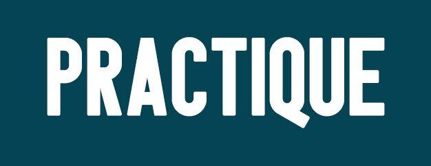
Practique
Practique is smooth and simple. Its tall block letters are bold enough to get a message across, but simple enough to not overwhelm the eyes.
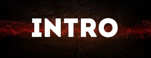
Intro Free
Intro Free adds a twist to the classic bold typeface. Its crisp edges and square-shaped letters make for a unique and impactful style that’s sure to grab your audience’s attention.
2. Elegant
Need a tasteful typeface to enrich your logo and give it a sophisticated feel? Try one of these options:
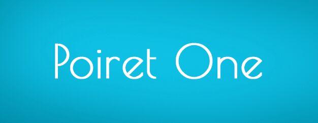
Poiret
This obtuse typeface is sleek and inviting. It pairs great with images and gives any logo a classy flair.
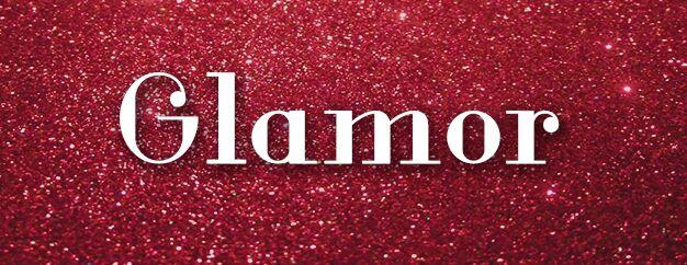
Glamor
True to its name, this font is glamorous. The curls and varying widths make it a fun and flirty option.
3. Funky
If you’re looking to make customers do a double take, funky typefaces will do the trick. These typefaces are perfect for adding a creative edge to your logo.
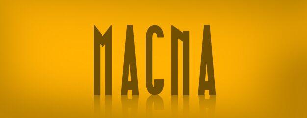
Magna
This typeface looks like something out of a mystery novel. It’s eye-catching—a great option if you’re trying to stand out from the crowd.
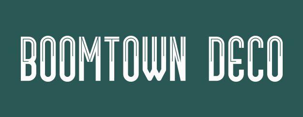
Boomtown
Boomtown is a quirky little font. Its asymmetrical lines will make for an unconventional yet tasteful logo.
4. Cursive
Cursive typefaces might be rare for logos, but they certainly provide a unique and playful branding opportunity. Cursive typefaces can range from formal to flirty.
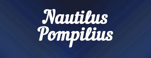
Nautilus Pompilius
This smooth cursive font is old school in a new way. It’s fancy yet easy to read.
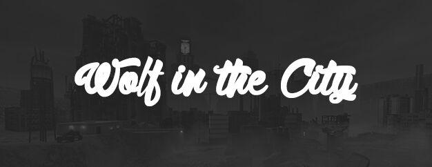
Wolf in the City
Wolf in the City is a looser, more casual cursive typeface. Brands looking to convey a relaxed image could benefit from this typeface.
5. Modern
Looking to keep up with the times? A modern typeface will convey just that.
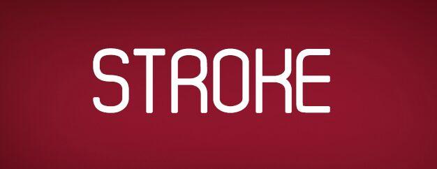
Stroke
Stroke looks almost futuristic in nature. You can tilt it, bold it, or italicize it for a modern and customized font.
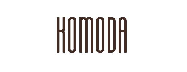
Komoda
Komoda is stretched and simple. Its urban feel can attract millennials, while its simplicity can appeal to anyone.
If you’re looking to create or redesign your logo, try one of these top designs. Not only will you be on your way to making a good first impression, but you’ll also save money by using a free typeface.

